Visualising and Analysing Yacht Polars IN TableaU
I have been trying to find a good way to analyse sailing polar data effectively. Polars for sailing are represented as a vector and use polar charts to display boat speed (BSP) magnitude at a specific true wind angle (TWA) for a given true wind speed (TWS). The yacht designers often provide this file from a "velocity prediction program” (VPP) simulation and we use these as targets for sailing and for optimized routing, although as it is never possible to always sail at 100% target, sea state and current also come into consideration. Hopefully this blog can be your tutorial to producing a similar solution.
When looking at this data, you will want to cleanup and manipulate the data interactively to understand your sailing performance. Tableau is very powerful at this but has initial limitations that make it very hard initially and required a few iterations to get there.
Limitations:
Multi-dimensional plot on non-joined data. (Predicted and sailed data can’t be joined on a dimension).
No polar plot, but can use x/y scatter with a calculation. This is limited to 2 layers with dual axis.
No radial grid lines
Initial views I used just displayed the sailed data as an x / y scatter and a line following the TWA path and TWS as a level of detail to split data in bands.
Polar plot as an x/y scatter across TWS
I wanted to be able to have true radial grid lines, theoretical target polar, and sailed data, with all three layers on the same chart. I tried different methods, but in the end, spatial data was the solution I came to. Spatial data in Tableau does not have to be joined and can be layered on the map as multiple layers. Each layer is independent: grid lines in layer 1, VPP target polar in layer 2, and sailed data aggregated in bins in layer 3.

Polar Analysis Dashboard
How do you get here? You can download the workbook from Tableau Public. The key part is that you need to transform speed at a specific TWA and TWS to x/y and then to spatial data. Tableau makepoint(x,y) creates a geo latitude and longitude measure for this field. Start off with a map with lat / lon on the shelfs then switch the row and columns to drop the map layer, which leaves you with a spatial x/y. Add all the fields you need and then add to the level of detail (LOD) and other shelves to build out the view.
Key calculation to change sailed data to the point:
IF [TWA] = 0 THEN
NULL
ELSEIF [Show Sailed Speed Marks] AND [ABS Rudder] < 5 THEN
MAKEPOINT([BSP]*SIN(RADIANS(ABS([TWA]))), [BSP]*cos(RADIANS(ABS([TWA]))))
ELSE
NULL
END
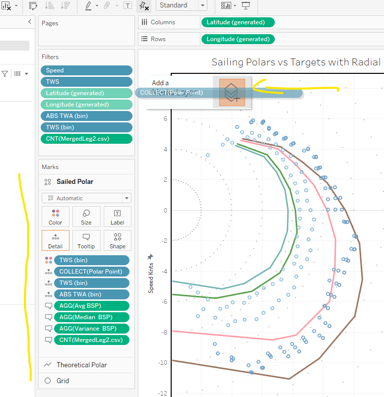
The yellow arrow points to the layer area where you can drop a field and the yellow line marks the left shelf to set the LOD and mark types etc.
This dashboard also allows you to see the box plot of the sailed mark when you select one of these marks. Each mark represents thousands of samples which are displayed as a box plot for you to make further decisions on this data.
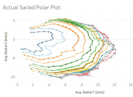
This data is from a Class 40 RC3 in leg 2 of the Globe40 race and has +- 2.5 million rows of sailing data.
It is very clear that we out-perform our VPP polar at low wind speeds and under-perform at higher wind speeds. It is not that the polar is wrong, it is just harder to sustain this target in rough weather and waves, both of which have a large impact. Analysis of this data allows us to update the VPP for long offshore races allowing the team to better model and optimize routing over thousands of miles.
Accurate polars are crucial for correct routing when planning and racing offshore. Read our blog on historical routing.
Tools:
Python script to transform polar files to row expanded data that is usable in Tableau.
Python script to help cleanup your sailing data before using it in Tableau.